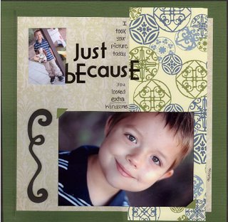
I used a chipboard swirl for my shape. This layout just doesn't sit right with me. It's been bothering me for days and I now know why (at least I think I do). It's the font. I don't think I like that Arctic Frog font with my handwriting. Who knows?

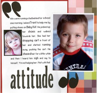
I used huge quote marks for my shape. When I showed my mother this layout, she thought there was too much white paper and she said, "Get rid of those quotes...they're distracting."
That's all I have for now.
Thanks for looking. :D

1 comment:
Ignore your mom! I like the quotes. I am going to scraplift this one. = )
Post a Comment